PARMMS VIEWER USER GUIDE
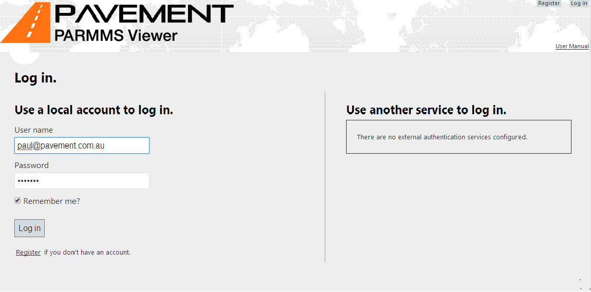
From the landing page of the application anyone can register as a user, but only an administrator will grant access to registrations. The registration process is equivalent to applying for access. Please review the last sections regarding registering for further information.
A registered user can access the application after logging in with the account name and password.
Index Page – Project Selection Page
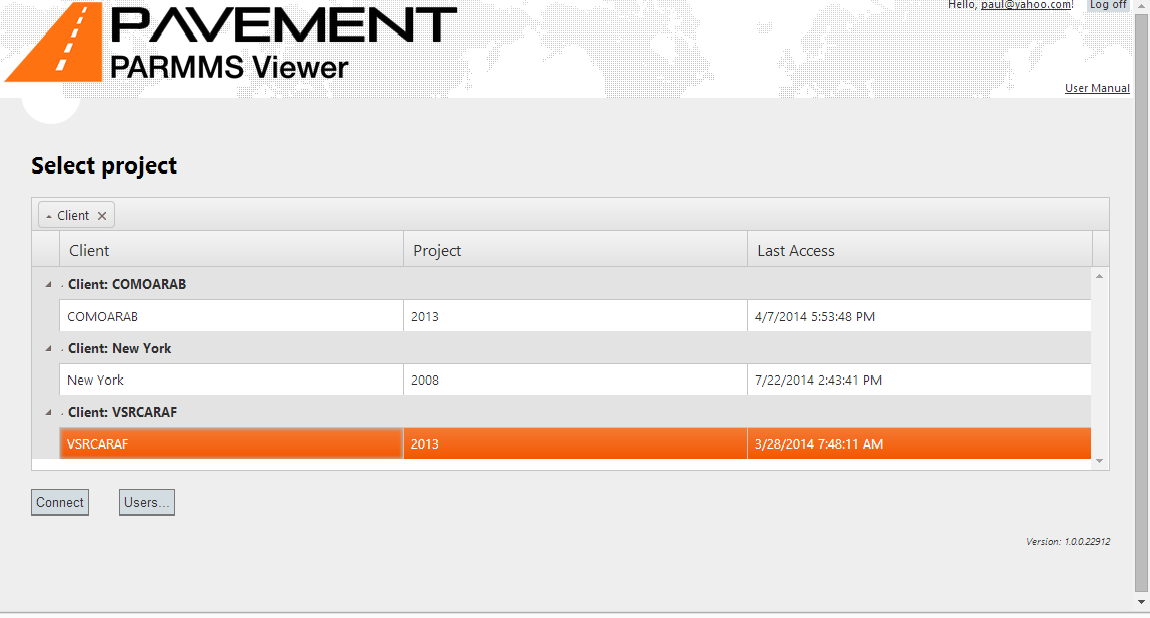
Once authenticated and after authorization is granted, the user needs to select which project will be accessed. The projects to which current user has accessed are organized by client and cycle. The user needs to select an item from the list and push Connect button.
Alternatively, from this page, any administrator can access the Users page which is designed for granting access to new registered users or revoking the access from existing users – please refer to the last sections of this document for details.
Main Page – Workspace overview
After the current project is selected, the user navigates to the main page, which is displaying a number of views, a menu and map, all organized under a current workspace, emulating a multiple document interface presentation.
Workspaces are defined outside of this web application, using an administrative utility application which defines the number of views, their content (title, columns, camera source, colors for series, display format, etc.) and their layout on screen.
One project can have multiple workspaces defined for all users – the so called “public workspaces”, out of which each user can start customize their own set of “private workspaces”, by moving windows around and saving the new layout. The private workspaces can drop existing views (if a view is closed while saving it will not be carried over into the private workspace), but cannot change their content.
Private workspaces can be deleted, or saved further into other private workspaces, whereas the public workspaces cannot be deleted.
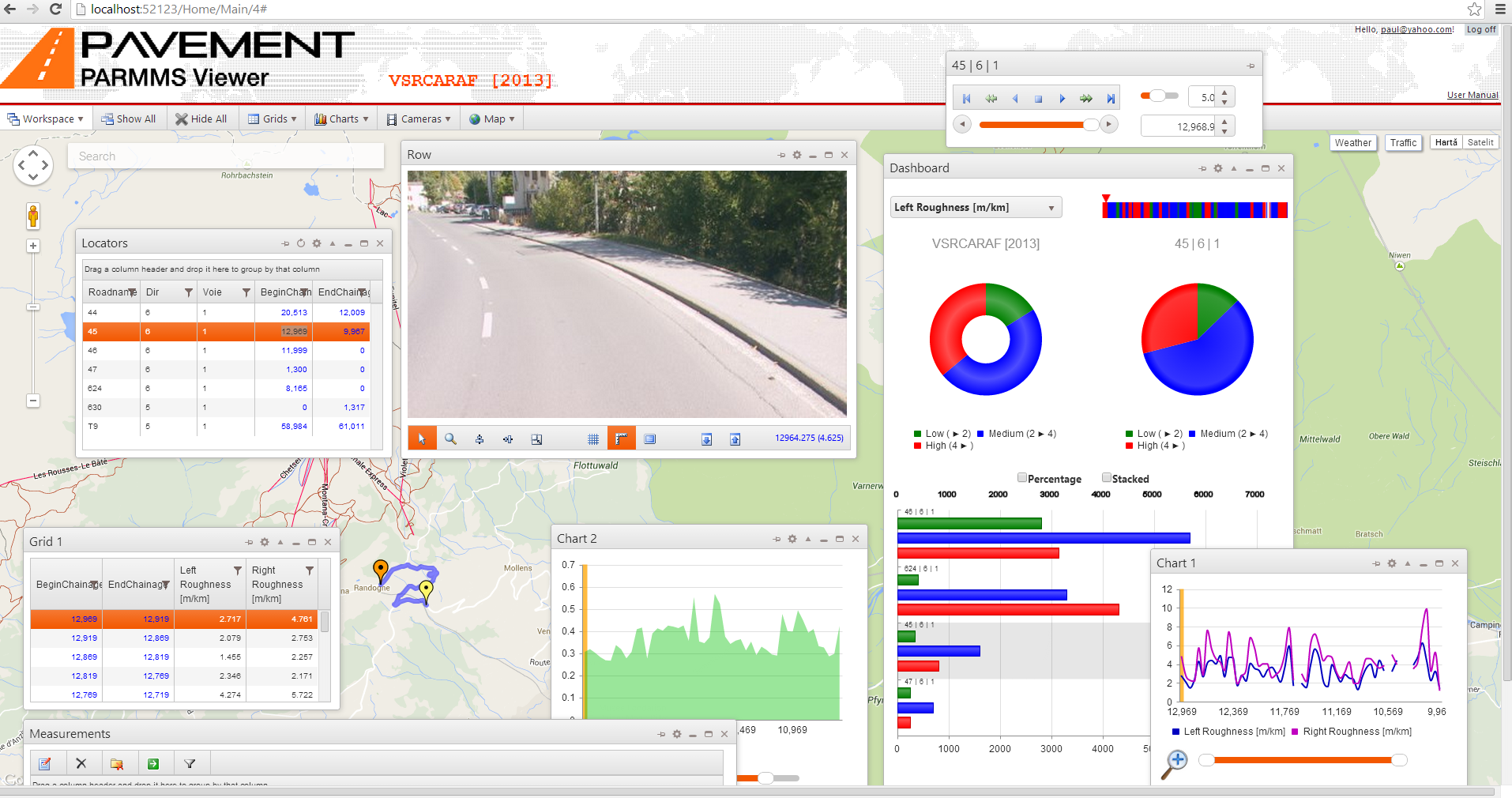
Above we have a typical workspace, containing the mandatory windows (Locators, Playback and Measurements) and several other optional customized views (1 Grid, 2 Charts, 1 Dashboard and 1 Camera), while the background/desktop area is filled by the GIS map with plotted data.
All these windows/views will be detailed in the following sections.
The distinction between mandatory and optional windows is given by the fact that the mandatory ones are required for the mere navigation, so that the user can pick one road, and then “play” the images and all the other optional views, synchronized, within the currently selected road.
All windows are synchronized, and each one can trigger a current navigation position change, while responding to navigation changes coming from other windows. For example clicking on a certain value on a chart will get all the views to that position, as well as selecting a grid row or stepping to the next or previous frame from a camera view. Clicking on a map or dragging the navigator marker will take all the views to that position, while performing the “playback” from the playback control allows an automatic presentation of images and synchronized data.
The menu is organized in a top level of main actions, and each action can have sub-items.
The Workspace menu item groups all the actions related to the workspace saving, changing and focusing the mandatory windows.

B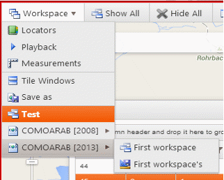
y
clicking on any of the top 3 sub-menus from the Workspace menu item,
the corresponding mandatory window gets focused, meaning that it is
brought in the center of the screen. This feature is helping the
user retrieve windows that were closed, minimized or otherwise taken
out of focus – the real estate of the screen being the main
challenge that is intended to be solved.
The Save As menu allows saving the current workspace as a new private workspace.
The current workspace (Test in this example) is selected in the menu list, and switching to any existing workspace from the current project or other existing projects (COMOARAB 2008 and 2013, last 2 items in the above example) can be done by clicking on the menu item.
Public workspaces and private ones have different menu icons – see the distinction in the COMOARAB [2013] project, with First workspace being the public one.
When using the Tile Windows item, all windows are arranged like a deck of cards, with their size preserved, so that the user can start re-arranging them. This can prove useful for screens with low resolution, where the intended layout of the workspace is not fitting the screen properly, and requires too much scrolling and dragging.
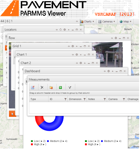
The next 2 menu items, placed in the top level – Show All and Hide All – are shortcuts for the user to simply close all windows so that the background map is not covered by anything, and conversely bring all windows to their current layout before being closed; it is similar to the “Show Desktop” command from Windows OS, in this case the desktop being the background map.
The rest of the menu items towards right, except for the last one (Map), allow the user to focus any of the optional windows.



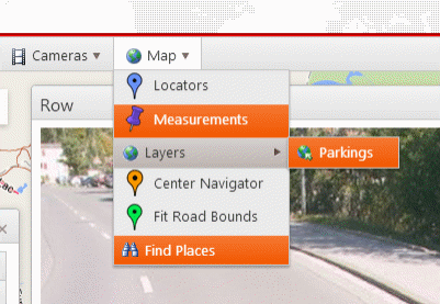
The last menu item – Map – allows the user to toggle certain data points on the map:
locators – pin points which represent the start and end points for each road that can be navigated
measurements – markers for extracted measurements
layers – any KML/KMZ files that are configured for the workspace
places – search box on the map, allowing random searches on the map
as well as panning and zooming to the levels given by the current road and position:
Center Navigator – the map will be panned so that the current position is shown in the center of the map
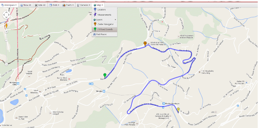
Fit Road Bounds - the map extent will be set so that the current road is entirely visible and fits the screen optimally
Windows Details
The windows from the workspace layout can be dragged for repositioning, re-sized, minimized, maximized/restored and closed, just like regular windows from a multiple document interface. The only window that is fixed in size and cannot be closed is the Playback.
At any one time, only one window is the active window, meaning that is has the focus – the focus is obtained by a window when clicked on its title bar or on its internal controls. When a window has the focus, it can be moved and re-sized not only using the mouse, but also with the keyboard:
moving the focused window: use arrow keys
re-sizing the focused window: use arrow keys while pressing the Ctrl key
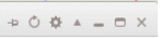
The following control boxes are available in the windows' title-bars
|
|
Pin – when pinned, a windows position will remain fixed relative to the screen if the user scrolls the overall window – the scrolling option will be automatically presented when the layout has windows that go out of screen. This option can prove particularly useful for the Playback window, given that it controls the navigation for all other windows automatically. |
|
|
Refresh – present only in the Locators window, allowing to drop any grouping, filtering and sorting currently applied on this window, and reloading the content from scratch, like a soft re-start of the workspace entry point. |
|
|
Export – allows the export, as a file that can be downloaded, of the content of the current window – it can be either a CSV file for tabular content, an SVG file for charts (can be viewed in a web browser), a JPG file for images, or an HTML file for the Dashboard composite view. |
|
|
Go – when pressed, the current view will be scrolled to show the current position of the navigator; for instance the user can scroll the grid or the chart ahead of the current position, to see what comes next, or have a preview of all the other values that are not currently in the viewport; by pressing this button the viewport is reset to show the current position, like a Go Back action. |
|
|
Minimize, Maximize, Close – typical windows buttons, used for resizing or closing the current window |
Locators
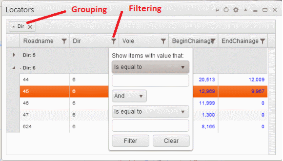
This window contains the list of roads that are available for navigation. By selecting one row from this list, the content of all the other windows will show the data of this current road – only one road can be current at any given time.
The columns of this grid presentation start with the so-called locator fields, which are the unique identifiers of the road, and also have the start and end linear reference (chainage) of the road, which in turn can be increasing or decreasing.
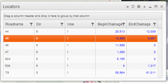
The grid control allows grouping by dragging the column header onto the grouping band, as well as filtering by clicking the glyph on the column header and sorting by simply clicking anywhere in the column header.
Playback
This window acts as a media player remote control, allowing the user to automatically navigate, forward and backward, through the current road's data: images, chart data-points, grid rows – all for the current navigator position, which is a single one at any given time.
The title displays the current road's locator fields, while the controls are as follows (top-down, left-to-right):
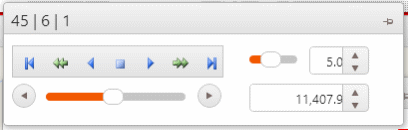
Player controls – buttons for Go First, Go Previous, Play Back, Stop, Play Forward, Go Next, Go Last; the playback and stepping is done in length increments, defined by the Step Size numerical up-down
Speed – control for setting the speed of the playback from left to right (slow to fast)
Step Size – numerical up-down set the length interval to be used when playing or stepping
Track-bar – showing the relative position within the entire road, and allowing straight navigation by dragging the handle
Chainage – numerical up-down allowing for straight navigation to any given chainage within the range of current road
Grid
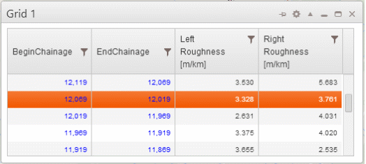
This window shows data from current road, aggregated in rows corresponding to continuous intervals. All grids will have the two first columns showing the start and end chainages for the row's interval, while the other columns can present any numerical, text or date-time values, as defined in a separate application that selects the column sources, captions and formatting (alignment, number of digits).
The grid can be filtered and sorted by clicking the column headers, but it cannot be grouped or reloaded like the Locators.
Multiple grids can be defined within a workspace, from different sources and at different granularities (length of the underlying aggregation interval).
Chart
This window is similar to the grid with respect of its data sources, except the data can only be numerical for its series, and the data points cannot be sorted or filtered – they are presented in the collection chainage order, with all their values.
A chart can present the data points in several series styles:
Line
Step
Scatter
Column
Area
The X-axis shows the chainage value, while the Y-axis shows the values of the series data points.
In the same way like a grid can only show so many rows in the current viewport, and the user may have to scroll to see the rest, a chart has a page-size defined, and a scroll control at the bottom, which allows “scrolling” through the charts data and bringing a different “page” of data in the current viewport.
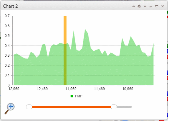
The window below is an area-style one series chart, showing the first part of an index called PMP data points. The current navigator position is the vertical cursor highlighting the current interval being navigated.
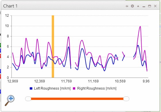
The next window is a line-style 2 series chart, with some gaps in the data-points and having the page size sufficiently large so that it shows all available data and no scrolling is necessary.
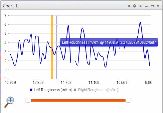
Hovering within the chart area will show a new vertical cursor with the tool-tip reading the current value of the closest series. By clicking on the legend items, series visibility can be toggled, and only some series can be inspected independently.
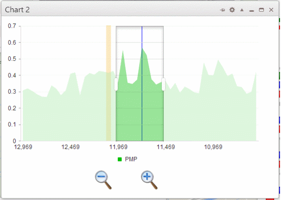
If the number of data point is deemed too large, so that the variations are hard to evaluate, the Zoom-In function can be employed to stretch a selected portion of the chart as follows:
click on the Zoom-In icon on the bottom left corner of the window
when presented with the new view, use the zoom selection area to define which portion will be stretched – drag the individual left and right handles of the zoom area, or simply click and drag the whole zoom area around
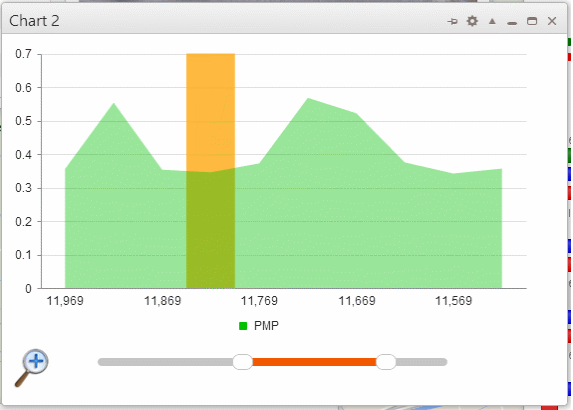
when the zoom area is selected, press the Zoom-In button (bottom right) to perform the zoom, or simply press Zoom-Out button (bottom left) to cancel the zooming action
the stretched zoom-in area is now available for a close-up evaluation
Dashboard
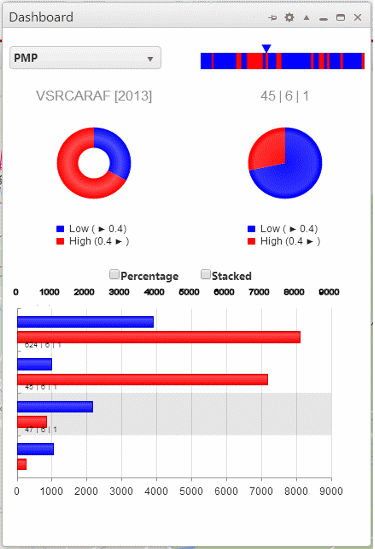
This composite window employs several controls to present an aggregated view on both global level (all roads) and road level (current road) of certain data sources. While grids and charts are showing rows and series populated with individual discrete cell values, in a dashboard these values are grouped in several defined ranges, and the length of road falling in each of these ranges is summed to present a comparative distribution of values within ranges, as well as an absolute length of each range.
For instance, when looking at the roughness values for roads, it can be considered that anything under a value of 2 is Low severity, corresponding to a relatively smooth road, while being between 2 and 4 is Medium severity, corresponding to a road that is still comfortable but not as smooth, and anything over the value of 4 is High severity, corresponding to a bumpy/rough road.
Having this criteria of qualifying the roads based on one particular value which is assigned to continuous intervals, the Dashboard can show the distribution of the values within the 3 established ranges/bins, both at a global level, for all the roads, as well as for the current road.
With this presentation, the user can see how much of the roads are smooth, acceptable and rough, in relative and absolute terms.
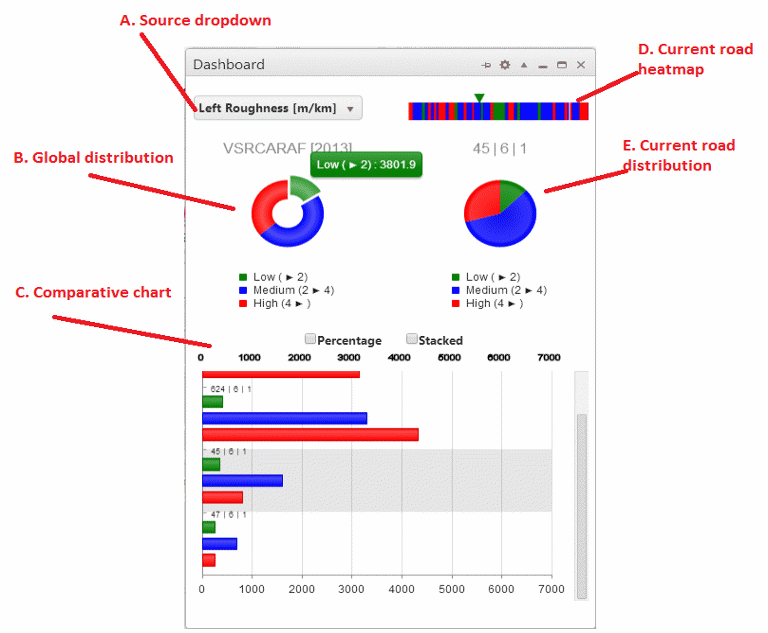
The following controls are used within the dashboard window:
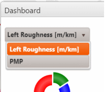
A. Source dropdown – allowing the user to switch between different data sources to be analyzed – when a new item is selected, all the other controls are populated accordingly
B. Global distribution – doughnut chart showing the global distribution of values within defined ranges/bins; accounts for all roads
hovering over a slice will show its tooltip reading the name of the range and the total length falling in the range;
clicking on a slice will explode it and will result in sorting the comparative chart based on the selected range, descending;
clicking an exploded slice goes back to the default sort order, which is the descending order or roads total length;
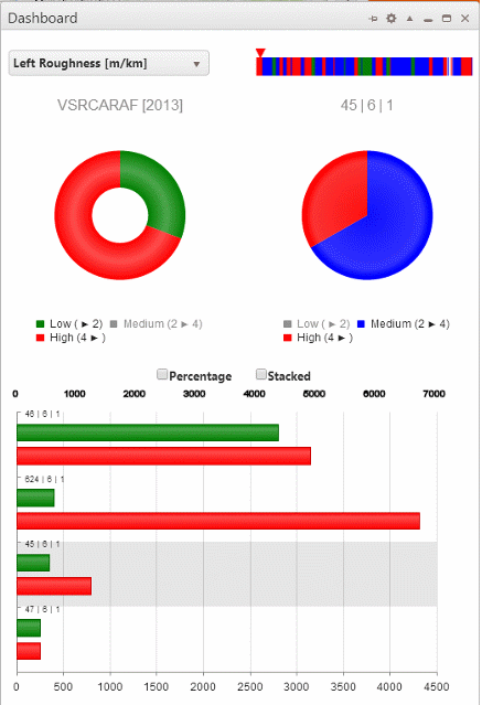
clicking on a legend item will toggle the visibility of that range, so that the global view compares less ranges
C. Comparative chart – bar chart showing all roads' individual distributions, with the current road being highlighted and automatically brought into view when switching the locator.
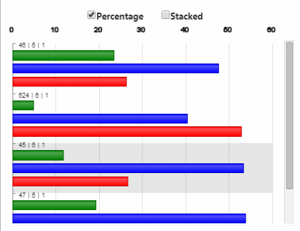
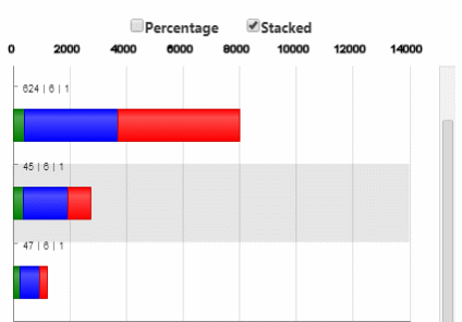
By default the values represent the actual length for each range out of the total length of the road, and the bars are not stacked; alternatively, using the 2 checkboxes on top of this chart, the data presented can be switched to a percentage, so that all roads are evaluated in a normalized manner, and also the bars can be stacked for a more compact view.
D. Current road heatmap – linear representation of the current road sections falling in the defined ranges; the current position is represented by the top arrow, in the color of the current range, and can be used for navigation by clicking on the desired spot.
E. Current road distribution – pie chart showing the ranges of the current road; similar to the global distribution, by clicking the legend items the range visibility can be toggled
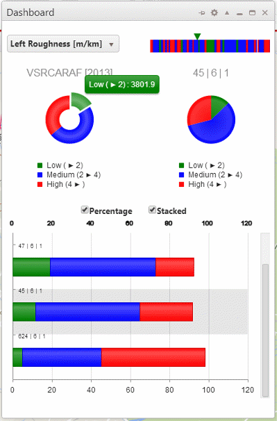
Below is an example of having the comparative chart showing percentage not stacked, and length stacked, followed by the dashboard showing percentage and stacked comparative chart:
|
|
|
|
|
|
An example of toggling ranges for both the global and road levels:
|
An example of switching the data source which triggers a re-population of the dashboard: |
|
Camera
This window shows images captured during collection by a given camera, and can be used for measurements if the camera has been calibrated. The calibration of the camera which enables the measurements is done outside of this application, and the presence of the controls related to measurements is toggled by the calibration existence.
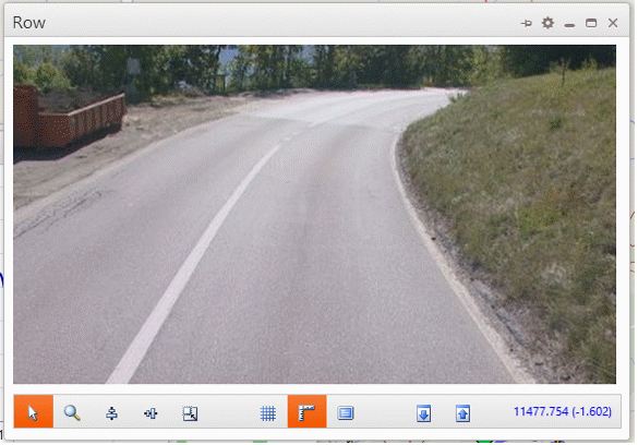
The bottom toolbar has 3 groups of buttons and one status label, as follows:
A. Mode Selection – this group allows picking one of the operation modes, which are mutually exclusive, so only one mode is current at a time
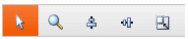
Select: allows hovering over existing measurements for getting tooltips and switching the current measurement for editing/deletion; it's the default mode, and if another mode button is clicked when selected, the mode becomes automatically the Select mode
Zoom: allows zooming a certain zone of the image while hovering; by clicking repeatedly in the zoom area, the zoom factor can be changed (use Shift+click for decrease, straight click for increase)
Horizontal measurements: allows performing a horizontal measurement by clicking the first point, dragging the mouse and clicking the second point – all measurements are assumed within the horizontal plane of the road
Vertical measurements: allows performing a vertical measurement, which in addition to the clicks for first and second point, requires the specification of the vertical plane, perpendicular to the road and to the direction of traveling, in which the measurement is performed
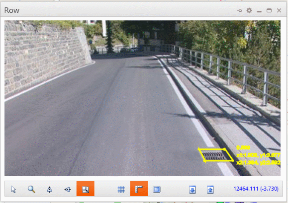
Area measurements: allow measuring a rectangle surface on the plane of the road.
B. Overlays
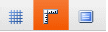
Show calibration grid: toggles the visibility of the calibration grid, which can be used to evaluate the confidence in the measurements, given that the bottom part of an image is yielding more accurate results than the upper part. Also, this grid shows the limit up until which the measurements can be performed, corresponding to the calibrated area from the road plane in front of the camera
Show measurements: toggles the visibility of measurements on images, with the current one being highlighted
Full Screen Playback: given that thumbnails (lower resolution images) may be used for playback, for bandwidth limitation reasons, this will toggle between showing a smaller image corresponding to the thumbnail actual size, or stretching the thumbnail to the size of the window
C. Stepping – allows stepping to the previous and next frames of the current camera, as opposed to the playback stepping which can be set at a different interval

D. Status label – displays the current chainage of the still image being shown, which can be different than the current navigation position – the difference is shown in parenthesis, and the image being presented is the last one taken before the current navigation position

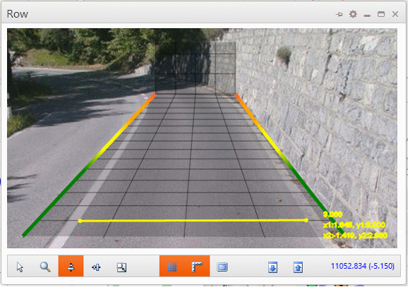
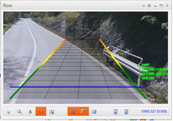
Below is an example of a horizontal measurement of a lane width, having the calibration confidence grid visible (measurements are allowed only on the bottom part of the image, up to the top of the confidence grid):
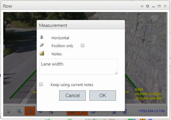
Once the clicking is done, a pop-up dialog is presented to record the measurement and annotate it with a comment. In case only the position is desired, and not the actual dimension, the Position only checkbox should be checked.
If a repetitive measurement is performed, such as lane widths every time when they change significantly or at a regular interval, by clicking the Keep using current notes the comment is reused on each subsequent measurement.
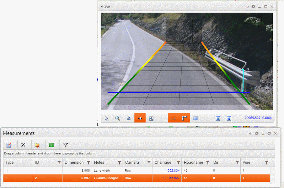
When performing a vertical measurement, the first action is to drag the vertical plane line (blue below) to the point on the road horizontal surface where the vertical plane is, then repeat the clicking and annotation steps similar to the horizontal measurement. Note that measurement are allowed from the vertical plane line up, and not below.
The recorded measurements are presented in the Measurements window, and the current measurement (one selected in the grid and image) is highlighted.
Performing an area measurement is similar with a horizontal one, except the 2 points clicked are determining a rectangle as opposed to a line:
Measurements
This window contains all the measurements, extracted from all the camera windows (because there could be more than one) and from all roads/locators.
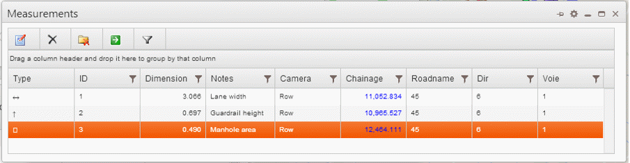
The columns of the grid are showing the measurement type, ID, measured dimension, notes, camera used, linear reference (chainage) and road (locator). The ID is displayed in the camera tooltips when hovering with the Selection mode on.
The toolbar has the following buttons:
Edit: allows changing the notes for the current measurement – only one measurement is current
Delete: delete current measurement
Clear: delete all measurements from the grid
Go To: navigate to the current measurement, which can be at a different chainage and a different road altogether than the current navigation position
Current Road filter: toggles the visibility of the measurements to show either only the current road's measurements and conceal all the rest, while having them stashed in memory, or show all measurements from all roads
Map
The map is serving as the background of the main window, like a desktop of the application, and can be seen without any window getting in the way by clicking on the Hide All main menu item.
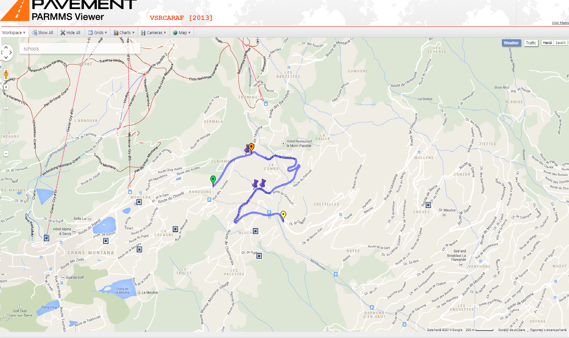
By default, the map shows the start and end points of the current road (green and yellow pushpins), the road path (purple polyline) and the current navigation position along the road. Clicking on the road path or dragging the navigator marker along the current road will change the current position.
From the map menu, several other items can be toggled, such as Locators, which will show pushpins for start/end of all roads (clicking one can switch the current road), measurements (purple pushpins, clicking one navigates to its position), and any KML/KMZ layers (clicking their markers will show any embedded information).
Also the map is powered with some GIS features, such as:
Search (for places)
Weather/clouds service
Traffic
Satellite/terrain/labels mode
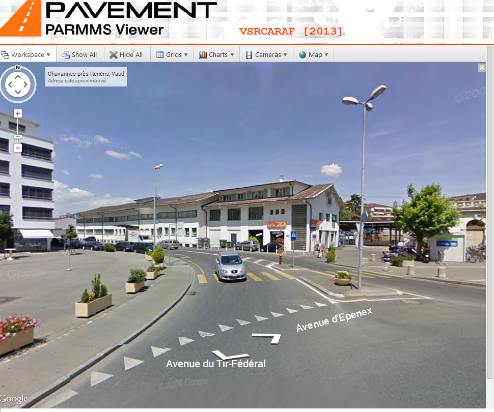
Street-view
Below is an example of the map showing the default layers and markers for the current road, not showing all Locators, showing the Search places “schools”, having the Weather layer enabled but not kicking in because of the zoom level, and showing the measurements:
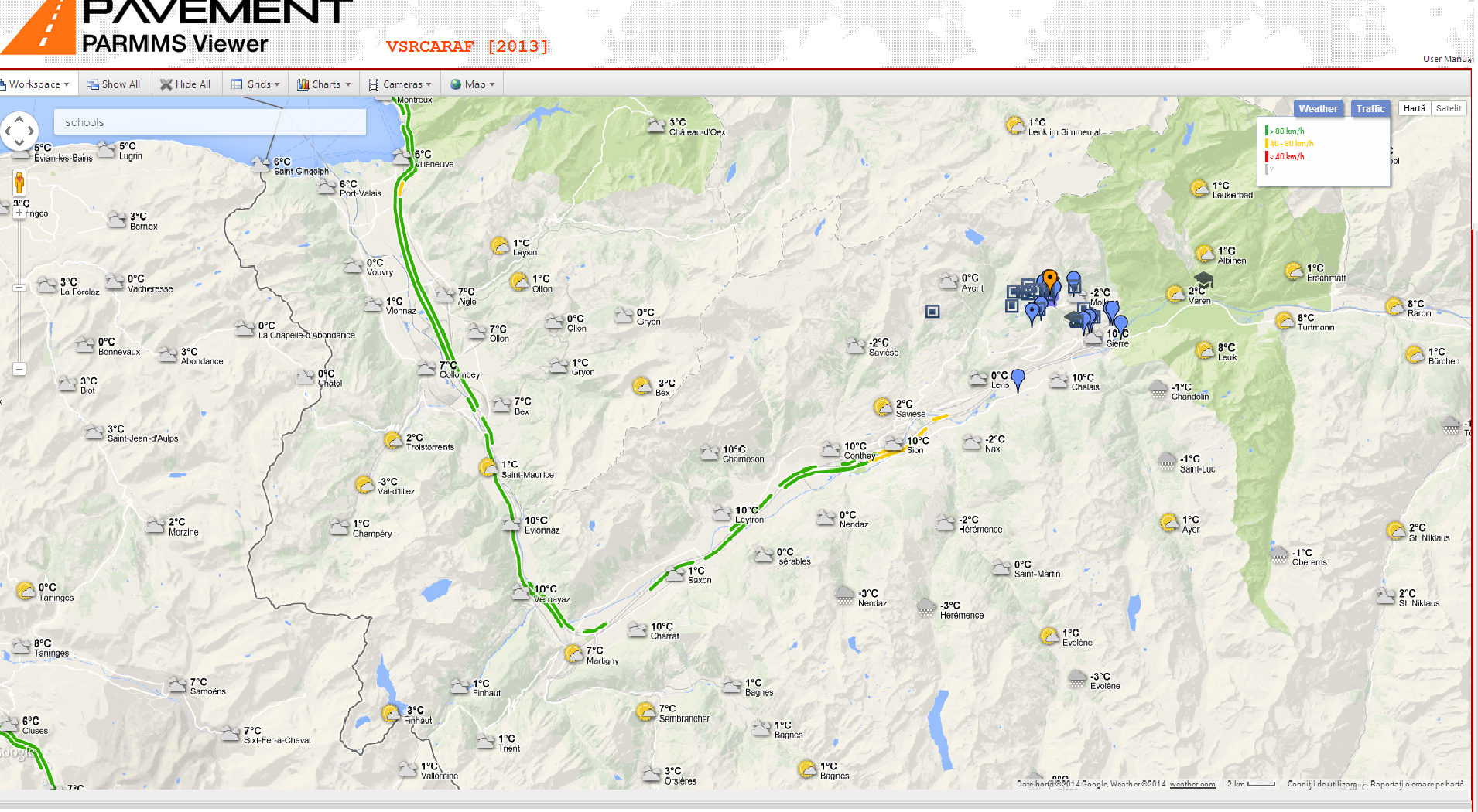
Following is an example showing all locators, showing the traffic layer and with the weather layer visible because of a higher zoom level
|
|
|
From an upper zoom level, the user can bring the map to the extent of the current road by clicking the Fit Road Bound menu item from the Map menu: |
|
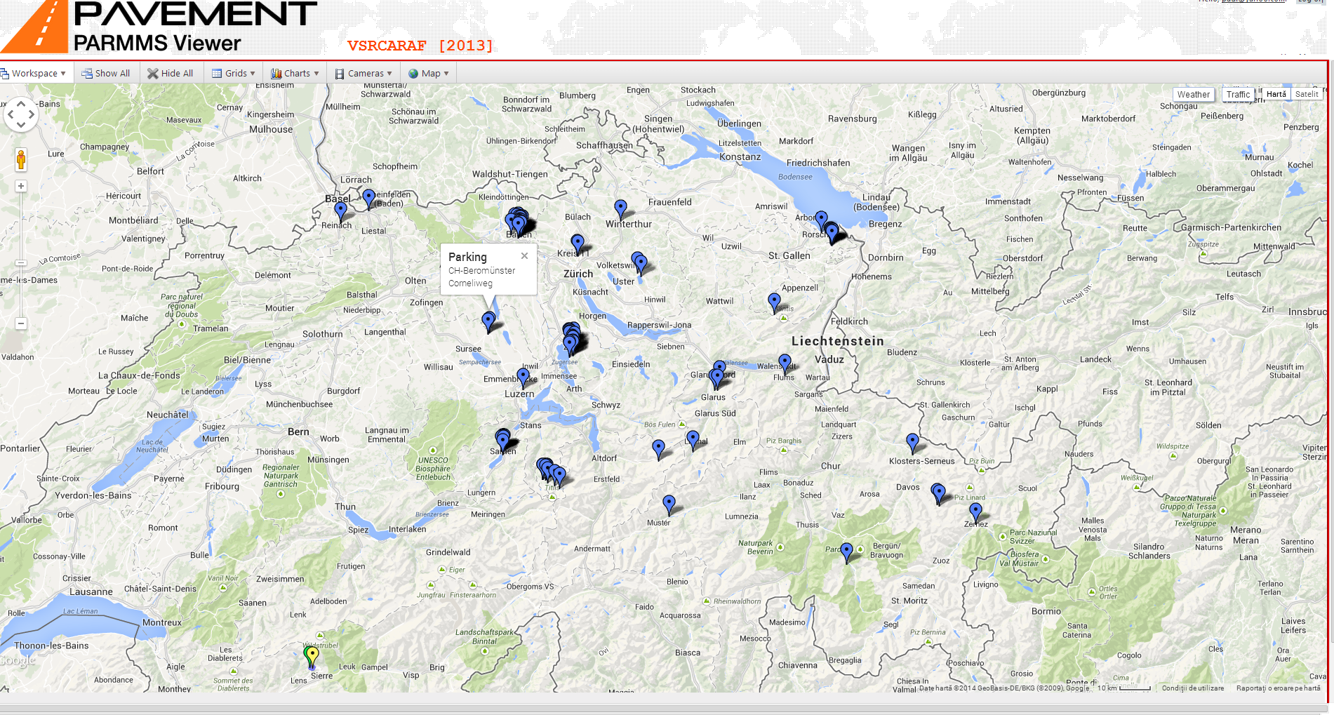
Next is an example of the map showing a KML file with available parking areas.
|
|
|
|
B |
|
|
User Management
As mentioned in the first section, the access to the workspaces of any project is allowed only to authenticated users, which in turn are authorized by a special category of users – administrators.
Once a user is authenticated and authorized, the access is allowed only for the projects that the administrator has granted it to the specific users.
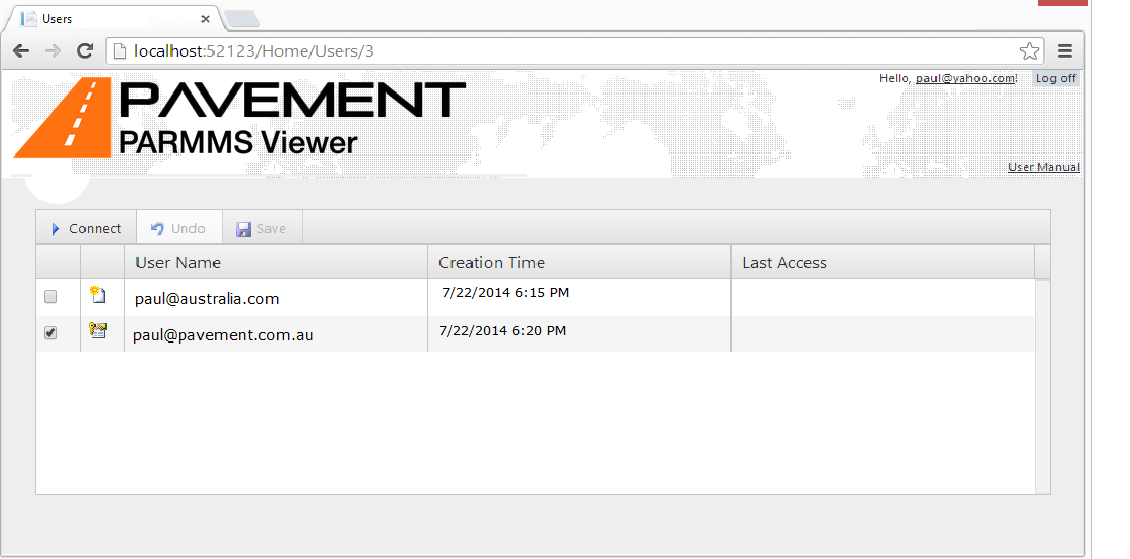
Registered users that are not authorized yet, are shown as pending in the list of users that is presented to an administrator when clicking the Users page from the Index page of the application (see first section).
By checking the box corresponding to each row, the administrator grants/revokes access to registered users, others than self.
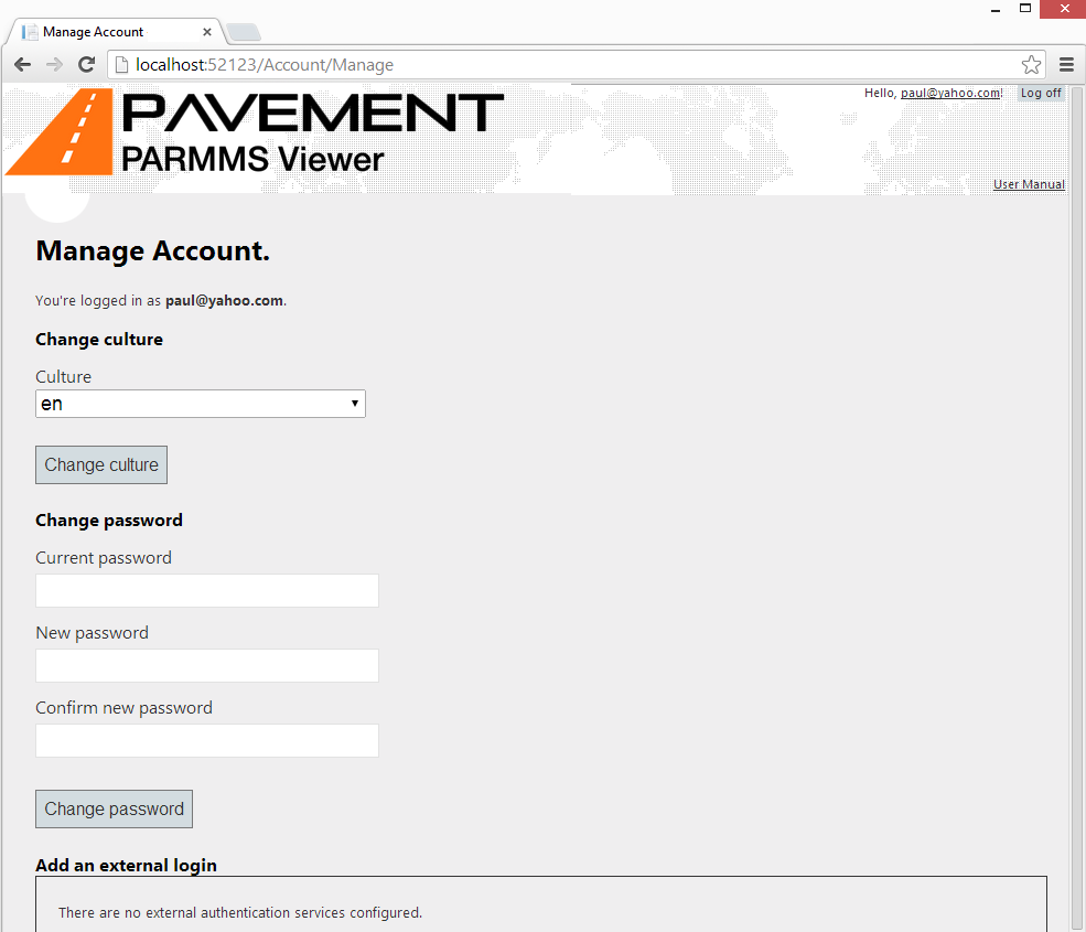
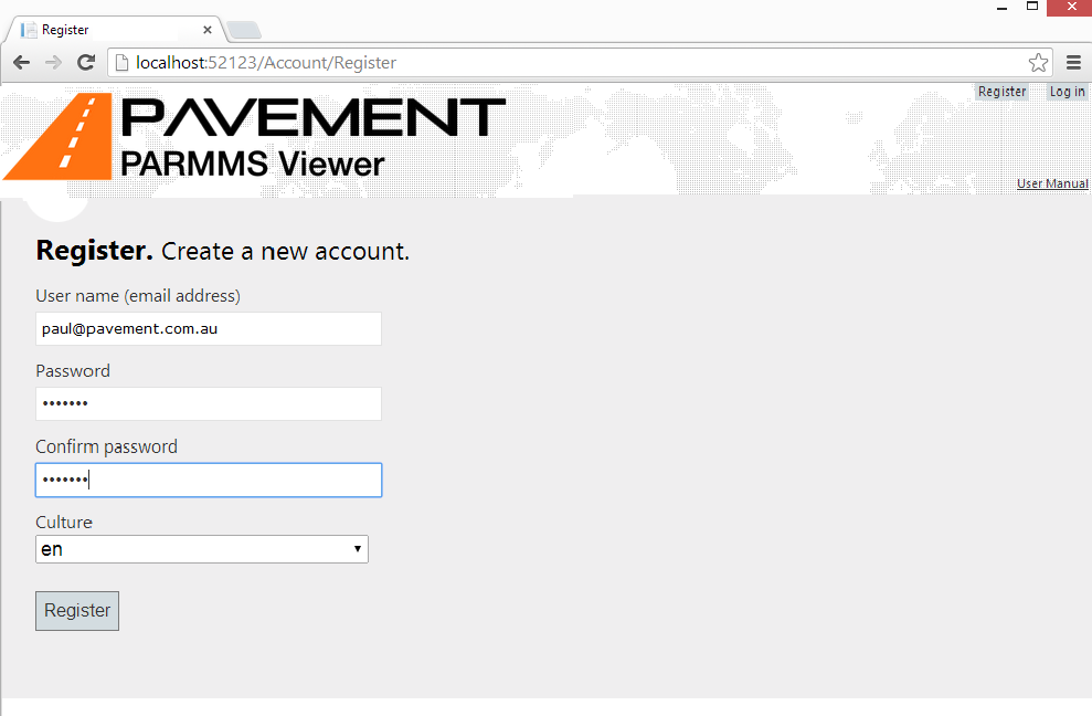
When registering as a user, the UI culture is selected too, and can be later changed from the Manage Account page:
Click on the top right hyperlink reading the user name to launch the Manage Account page: